
Since its humble introduction in 1990 as a brand of Hilton Worldwide with four hotel properties that were originally branded as CrestHill by Hilton, Hilton Garden Inn has been a symbol for enthusiasts of Hilton as a mid-range yet “laid-back sophisticated” brand with a “casual garden courtyard ambiance” which offers consistency to guests among 951 hotel properties in 55 countries around the world at a reasonable price…
A Closer Look At the Hilton Garden Inn Logo
…but have you ever taken a closer look at its logo?
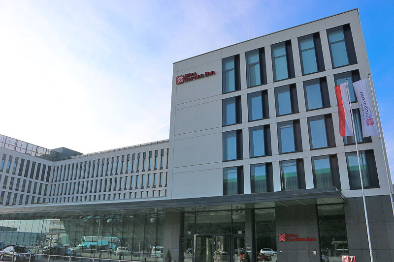
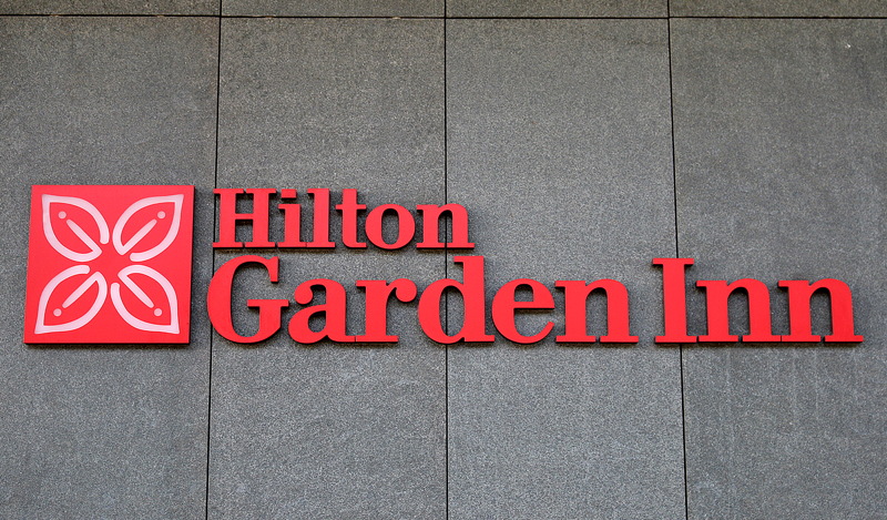
Three occurrences of the Hilton Garden Inn logo appear in the above photograph, in which the logotype generally complements the logo itself, which at first glance appears to be a red box that contains a flower or some other natural entity comprising of four leaves, which is meant to evoke a part of a garden…
…and — upon a closer look — one might find the resemblance of the capital letter H for Hilton in the logo, as highlighted in blue on the right in the above graphic…
…but separate one of the “leaves” — the top left one was extracted from the logo — and rotate it once; and you will see that each leaf consists of a stylized upper case letter G with a seemingly random dot, as the G stands for garden. Rotate the “leaf” again 90 degrees clockwise, and you will find that a lower case letter i for the word inn is integrated in the appearance of the “leaf” — and suddenly, the purpose of the dot is clearer.
Final Boarding Call
You may never look at the official logo of the Hilton Garden Inn brand the same way ever again.

No input from Hilton was used in this article, which is simply my interpretation of the logo. No other interpretation of this logo was found and incorporated into this article.
As for my qualifications to analyze this logo, my undergraduate degree is a Bachelor of Fine Arts at one of the top rated art schools in the world — along with years of professional experience with graphic design and other creative work.
All photographs ©2017 by Brian Cohen.
