
Having been in the restaurant business from its humble beginnings in the District of Columbia as a root beer stand with only nine seats since 1927, John Willard Marriott decided to expand into the lodging industry almost 30 years later in 1957 with the grand opening of the Twin Bridges Motor Hotel in Arlington in Virginia, which initially operated as an independent motel property under what was purportedly the largest association of independent motel operators in the world known as Quality Courts United, Incorporated — which was the predecessor to Choice Hotels International, Incorporated — and the motel was easily accessible off of the highway.
A Closer Look At the Marriott Logo
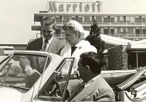
Later to be renamed the Twin Bridges Marriott, this first hotel sported the Marriott name by 1959 — as seen in the photograph on the left — and was demolished in 1990 as its final fate…
…but the name Marriott was widely recognized in the hospitality industry decades before then; and the official logo of the lodging company endured few changes since then, as seen in the aforementioned photograph.
Considering that one of the Hot Shoppes became the first drive-in restaurant on the East Coast and that Twin Bridges was originally a motor hotel, easy access from the road for weary travelers was an important part of the hospitality concept to John Willard Marriott — along with good food and good service.
At first glance, the M in the Marriott logotype obviously appears to be a capital letter M that was eventually transitioned into the logo for Marriott.
The original logo had the M stylized with a crown — apparently, the guest was considered royalty and should be treated that way…
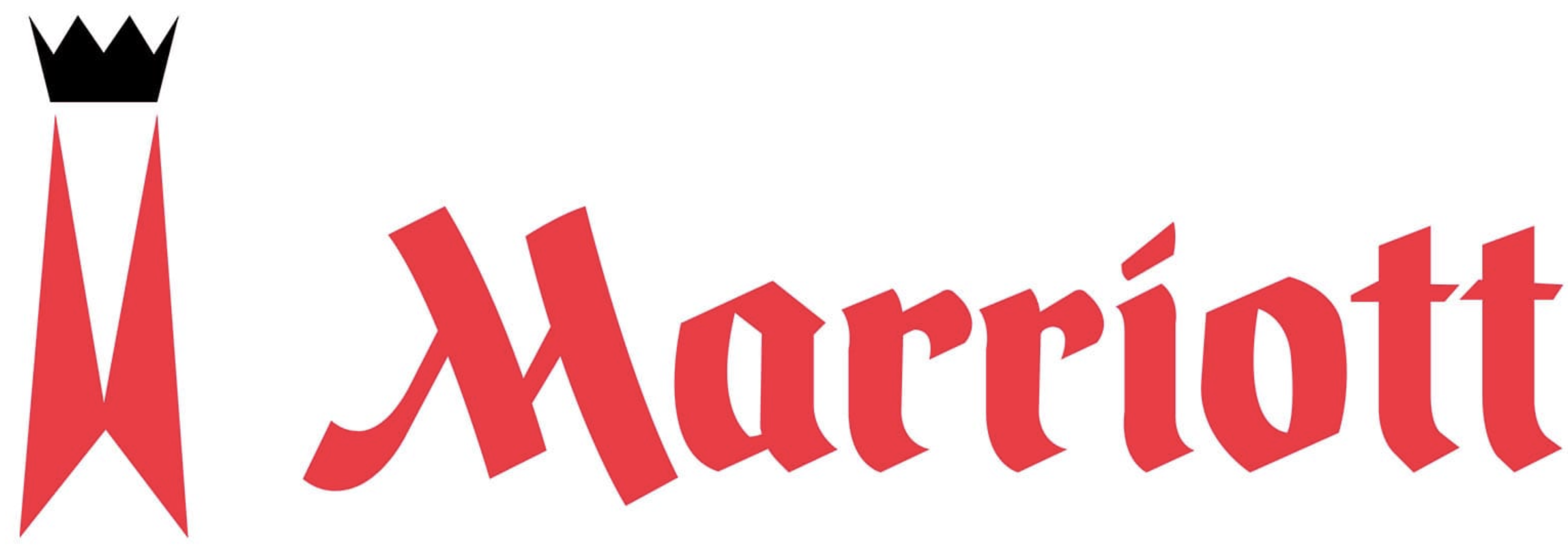
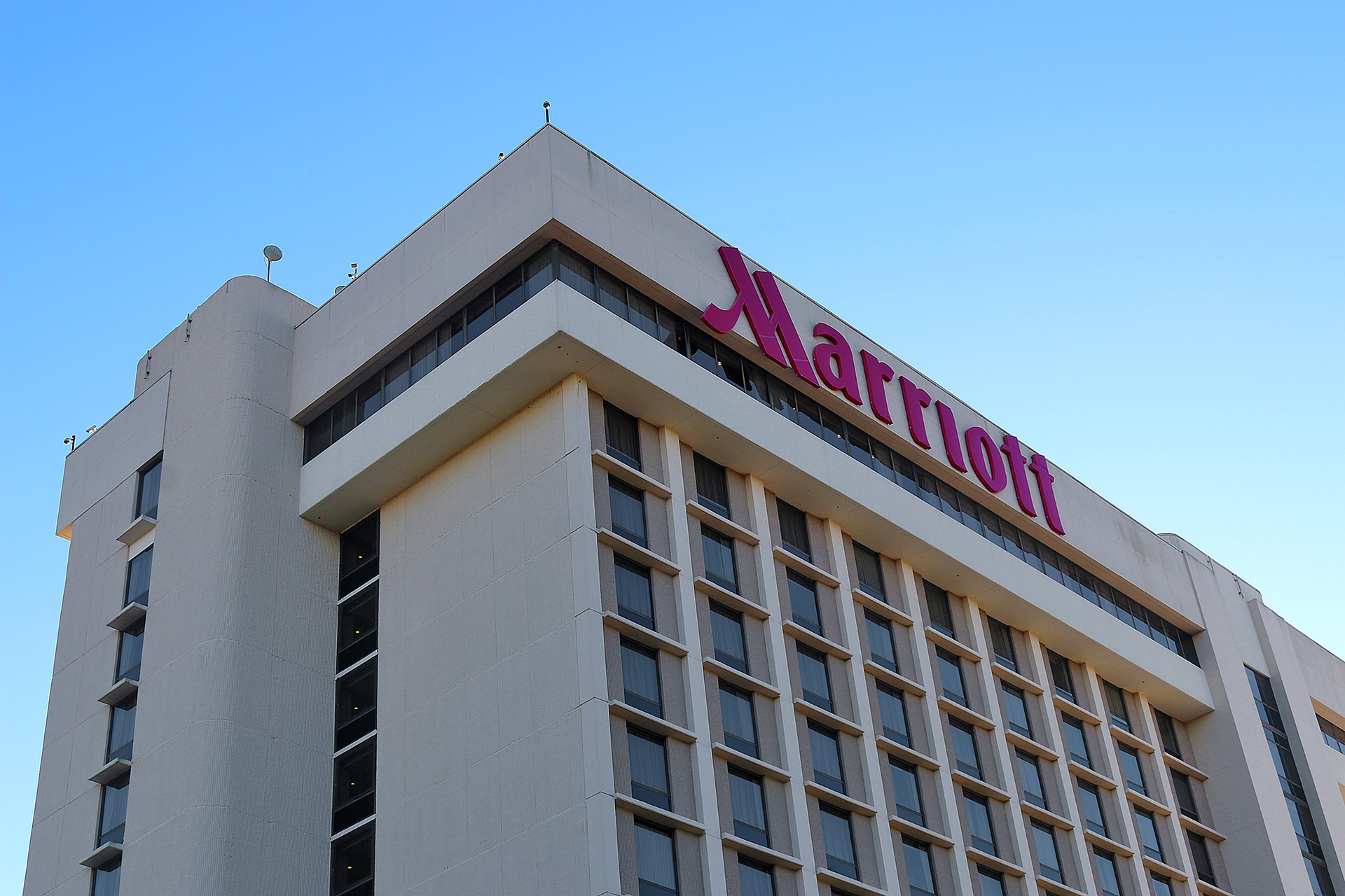
…but the M in the Marriott logotype was smoothed and colored red instead of an orangish-red — and the current M logo sports an even deeper red hue.
I am not sure if this was intentional; but my guess is that John Willard Marriott wanted his guests to know that accessing his ventures from the highway would be convenient. To me, the M as the Marriott logo over the years resembled a divided highway with an exit ramp — especially in the logo on the left, which was used from 1989 through 2013 — to convey that convenience to the motorist.
Final Boarding Call
You may never look at the official logo of the Marriott “M” the same way ever again.
No input from Marriott was used in this article, which is simply my interpretation of the logo. No other interpretation of this logo was found and incorporated into this article.
As for my qualifications to analyze this logo, my undergraduate degree is a Bachelor of Fine Arts at one of the top rated art schools in the world — along with years of professional experience with graphic design and other creative work.
Other articles in what is becoming the Closer Look at Logos series here at The Gate includes:
- A Closer Look At the Hilton Garden Inn Logo
- Remembering the United Airlines “Tulip” Logo and Its Designer
- Designer of United Airlines “Tulip” Logo Would Have Been 100 Years Old Today, May 8, 2020
Photograph ©2021 by Brian Cohen.
