
“I recently found a resource more reliable and easier to use than both of these. It’s covidcontrols.co . It includes the entry restrictions based on where you are traveling from and the current pandemic status. It’s free too, which unfortunately IATA no longer is.”
A Third Reliable Resource of Countries With Updated Travel Entry Restrictions Due to 2019 Novel Coronavirus?
The paragraph you just read was posted by Mark — who is a reader of The Gate — in the comments section of this article which pertains to a reminder of two reliable resources of countries with updated travel entry restrictions due to the current 2019 Novel Coronavirus pandemic. In that article, I listed both the Bureau of Consular Affairs of the Department of State of the United States and Timatic of the International Air Transport Association as those reliable resources — along with direct links to them.
I decided to try it and see how it works.
Be prepared to play with this tool for quite a while, as there are many features. For example, you can simply type in a field in the upper left corner the name of a country, state, province, or geographic region of which you would like information and search.
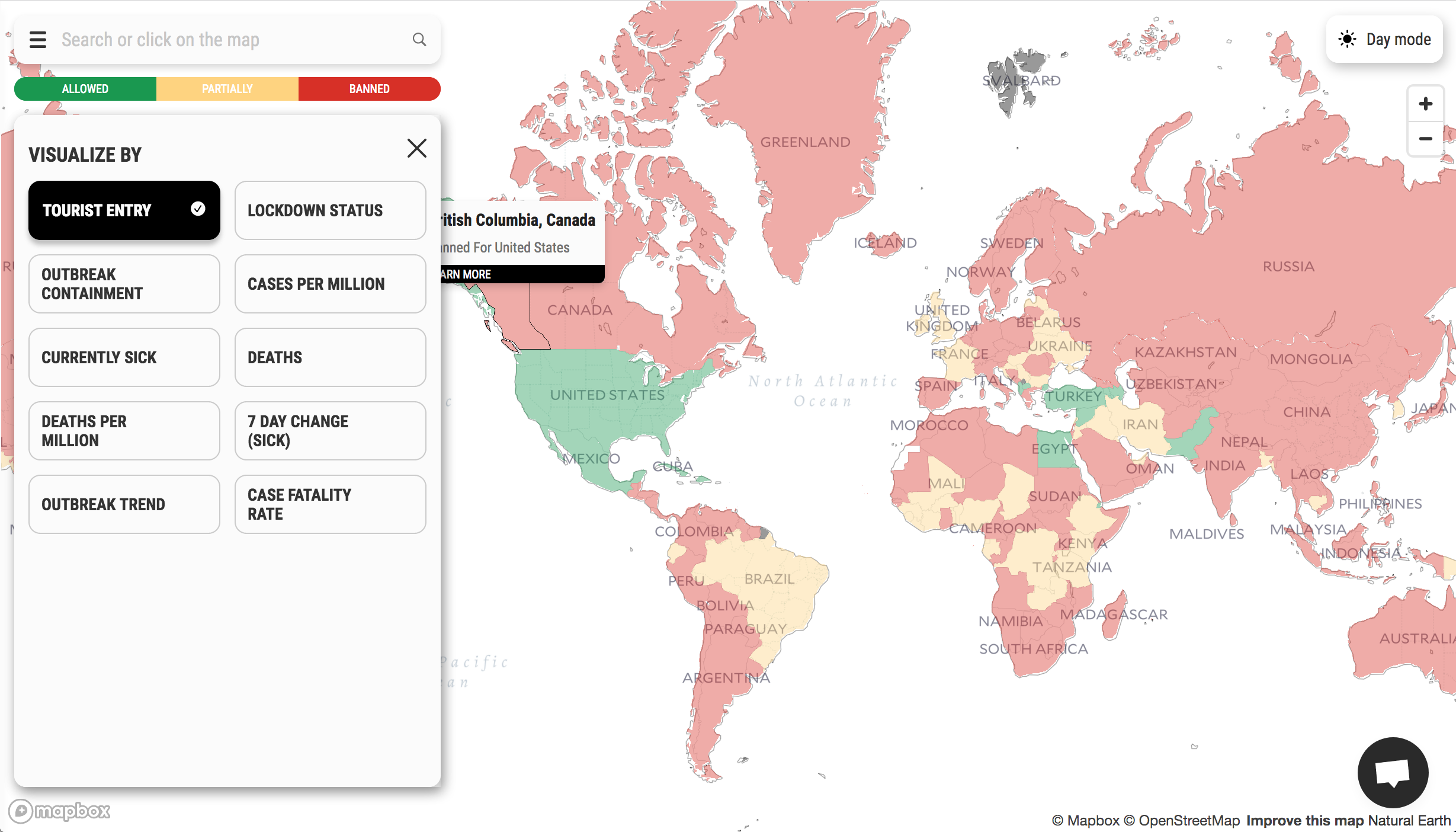
You can visualize the map by the following criteria:
- Tourist Entry
- Lockdown Status
- Outbreak Containment
- Cases Per Million
- Currently Sick
- Deaths
- Deaths Per Million
- 7 Day Change (Sick)
- Outbreak Trend
- Case Fatality Rate
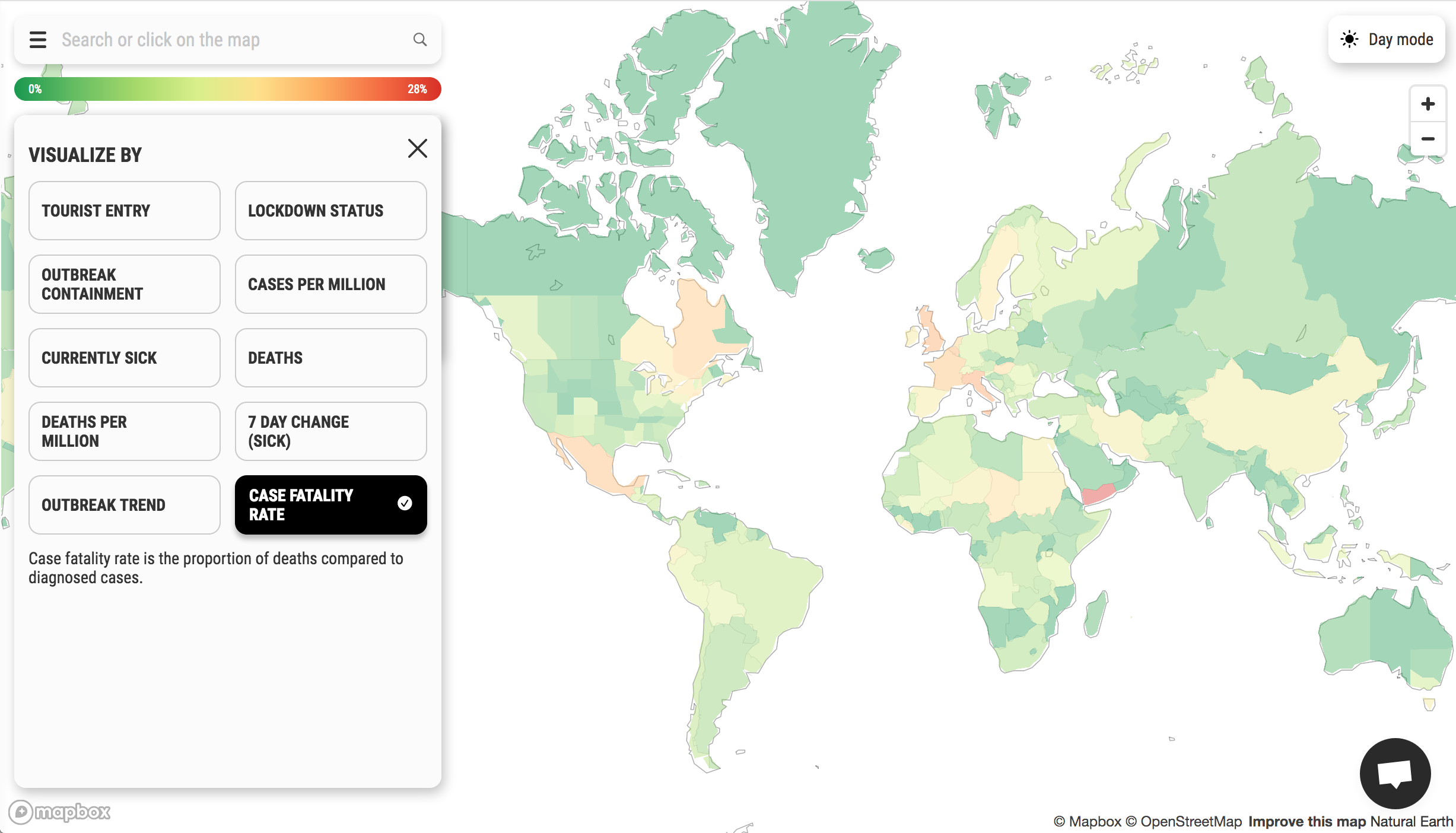
Interestingly, the case fatality rate for much of the world is fewer than four percent. Only Yemen has a case fatality rate of 28.85 percent.
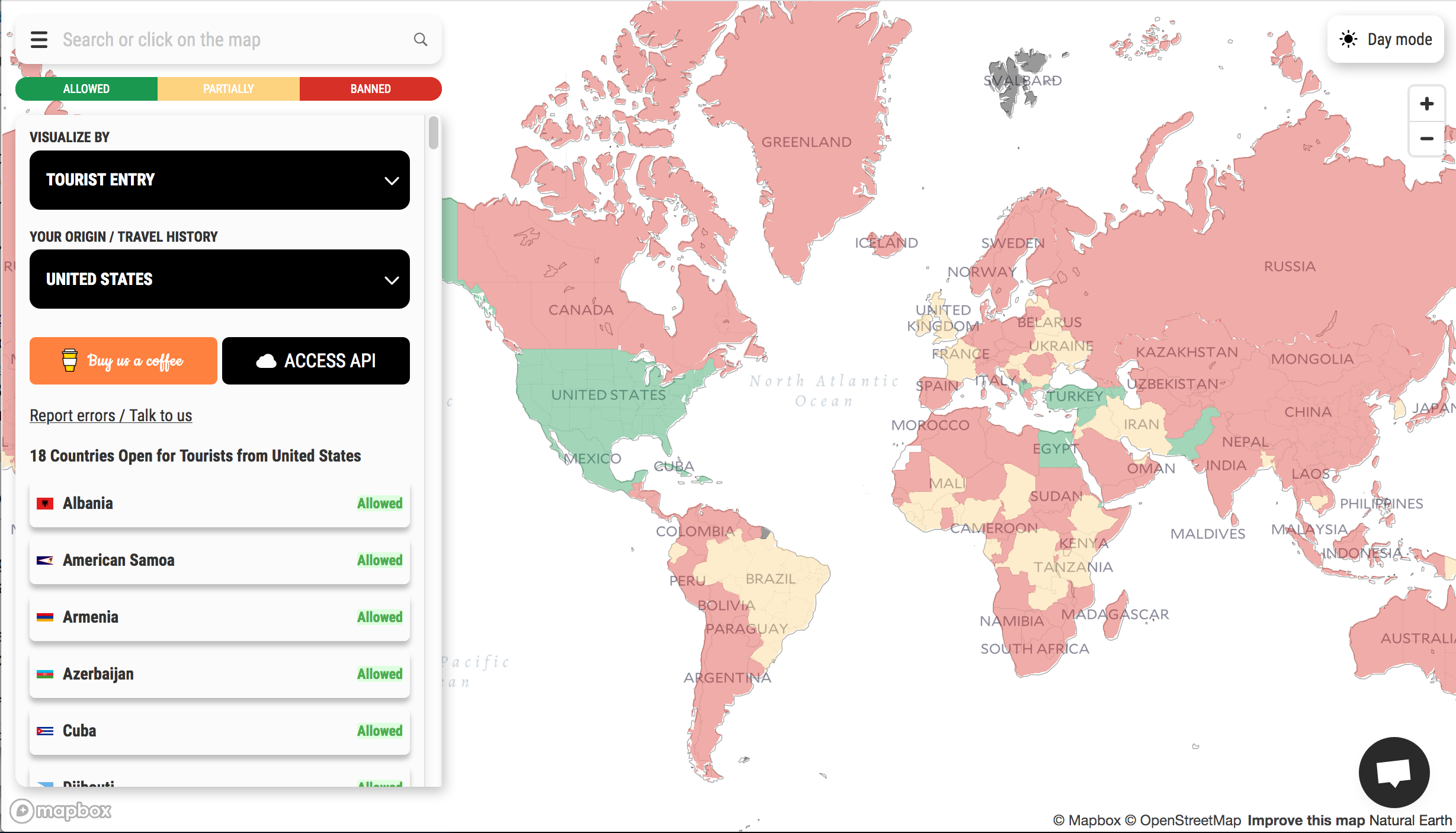
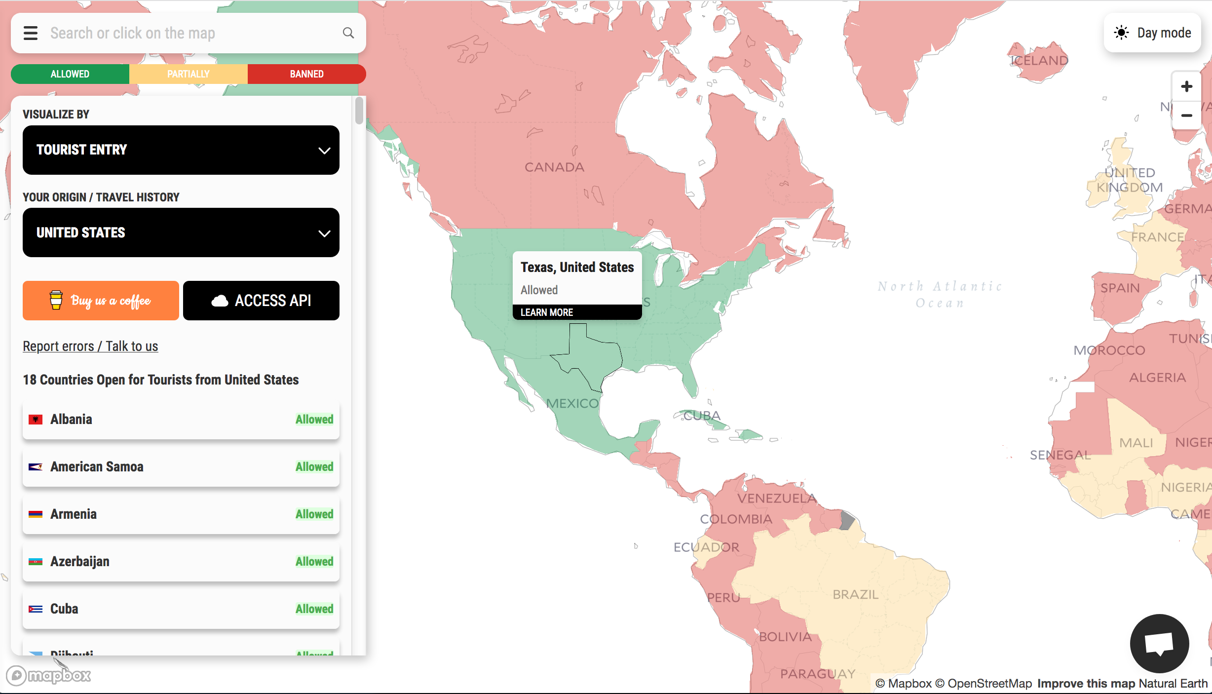
You can also choose your Origin or Travel History. In choosing the United States as an example, the map claims that only 18 countries are open to tourists from the United States as of today, Saturday, September 5, 2020.
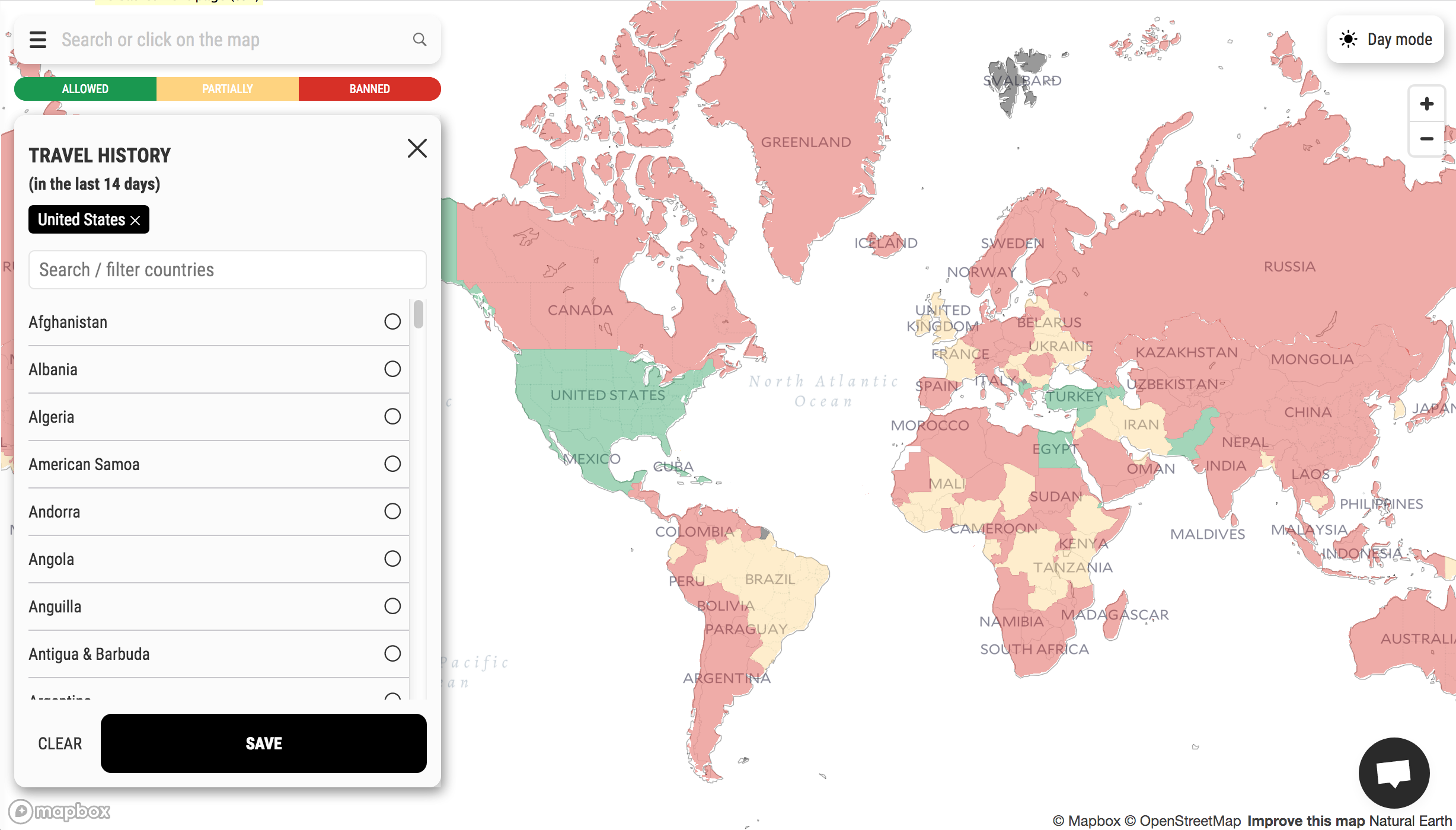
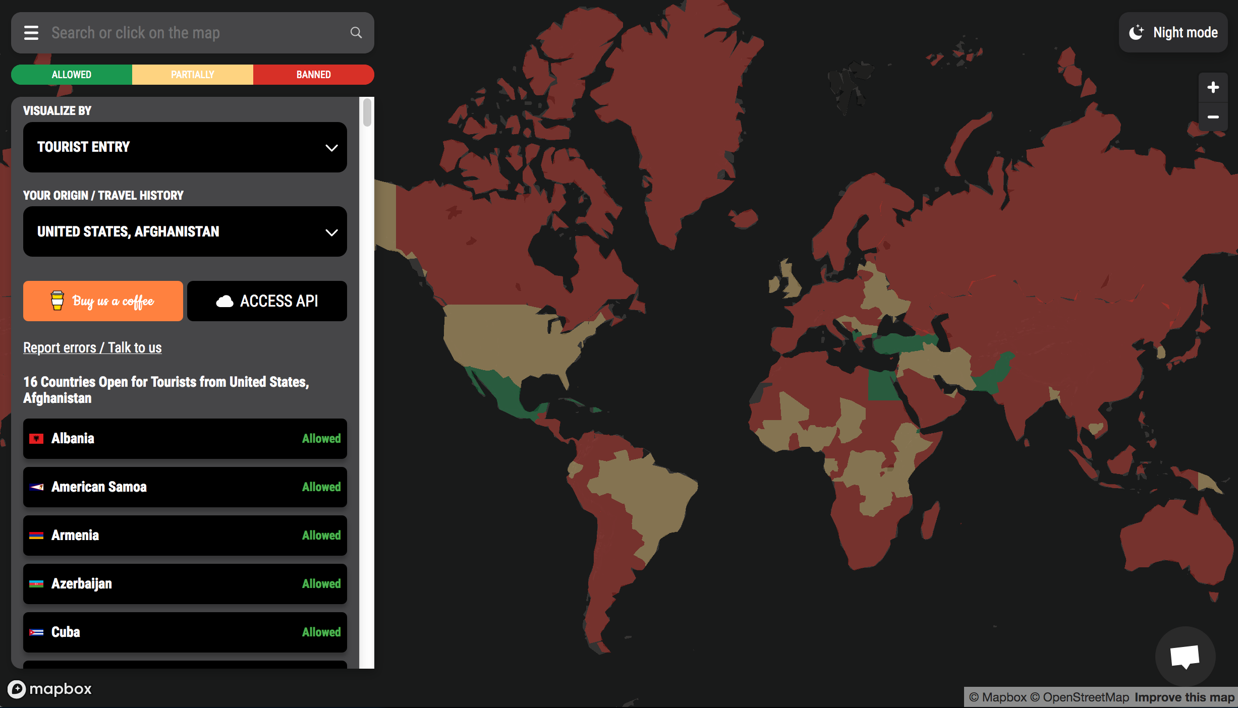
A very nice feature is that if you intend to travel to multiple countries, you can choose more than one country from which you plan on originating. For example, adding Afghanistan to the United States has the map claiming that only 16 countries are open to tourists from those two countries.
In addition to zooming in and zooming out of the map using the magnification feature — you can also click and drag the map around — placing your cursor over a specific area highlights a country, state, province, or geographic region. The United States, Canada, and Australia are some of the countries which are divided into states or provinces; while Russia is divided into federal districts.
If you click on a specific country, state, province, or geographic region, you will get additional information and the latest statistics about it on the left — including but not limited to:
- The number of people who are currently sick — both in total and during the past seven days
- Outbreak containment as a percentage
- Outbreak trend
- Daily new cases
- Government restrictions
- Search upcoming flights
- Links to sources
- Links to the latest news
You can even choose from Day Mode or Night Mode.
…But Is the Information Accurate?
This map has great potential to be an invaluable tool — but how accurate is the information?
I asked someone I know who has real information pertaining to the current 2019 Novel Coronavirus pandemic in three states in the United States…
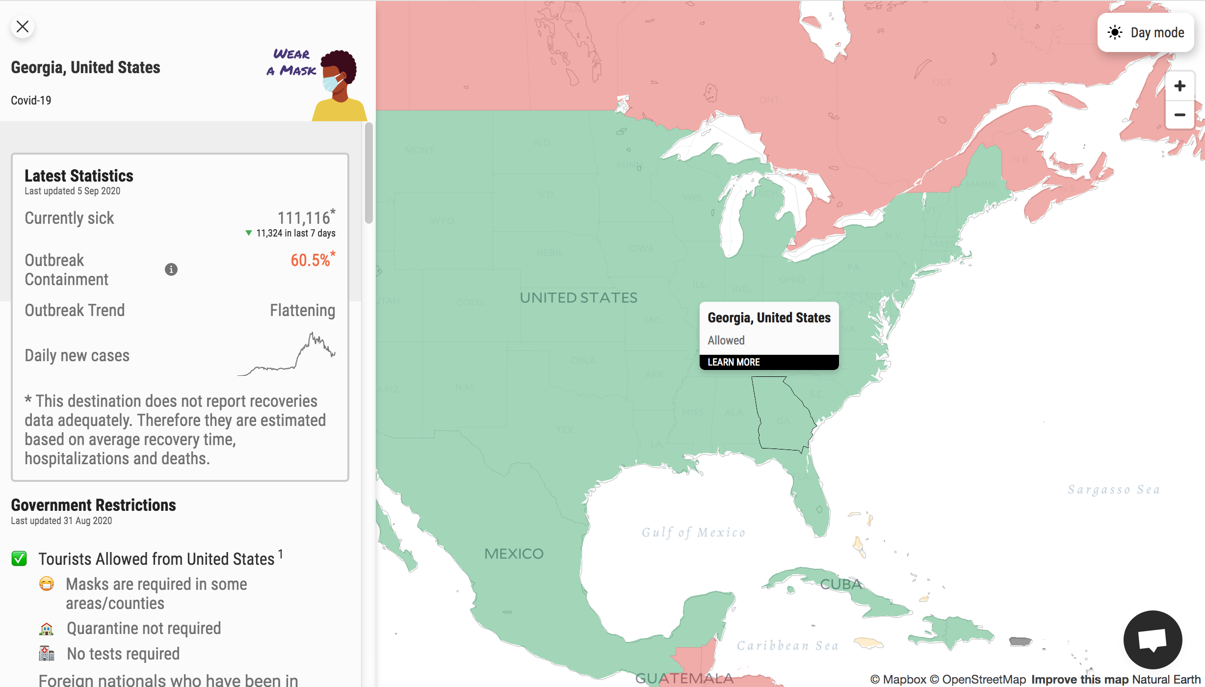
…and the information in the map is “close” but not accurate. For example, the map claims that the state of Georgia is under lockdown — but that is only true for a small portion of the entire population of the state, which was only under a mandatory lockdown of sorts months ago.
“And it admits” that the state of Georgia does “not report recoveries but gives a numerical statistic calculated with recovery numbers. And it says are businesses are open. But several are not. And” that “attractions are closed” in Georgia, according to that aforementioned person. “But most are open.”
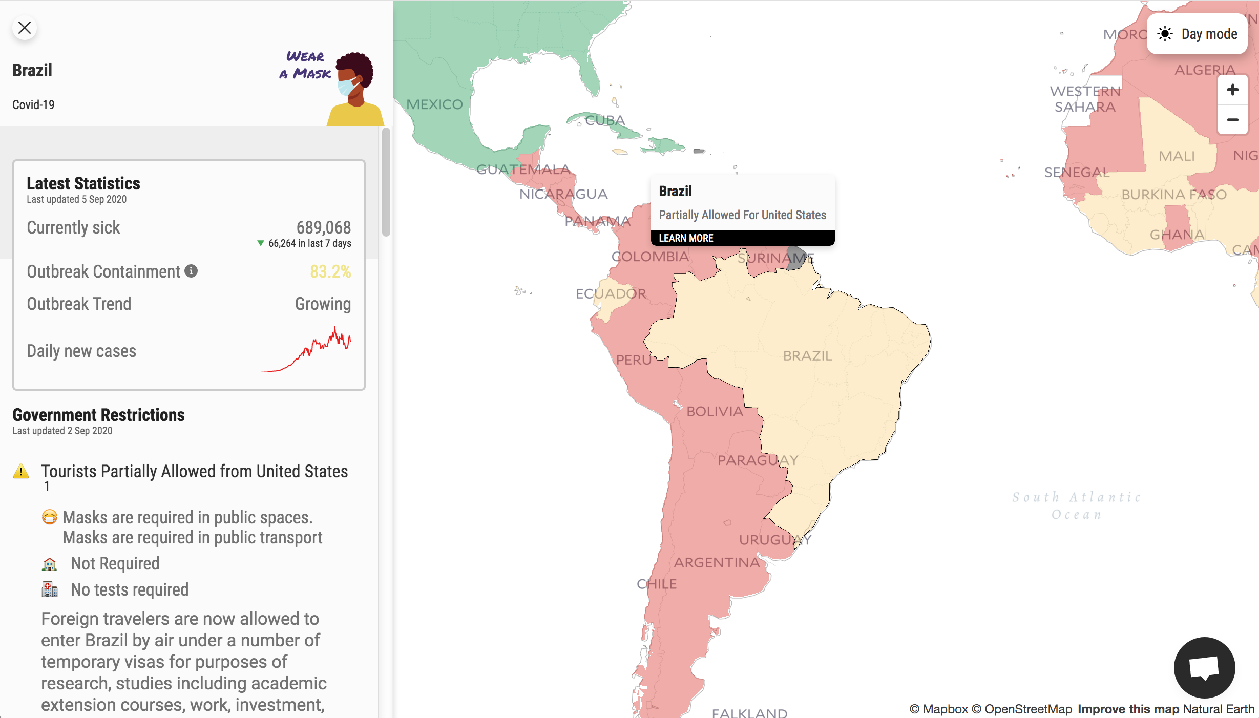
Other anomalies include that “Brazil is green and says it is open for tourists. But then when you click on it, ‘Foreign travelers are now allowed to enter Brazil by air under a number of temporary visas for purposes of research, studies including academic extension courses, work, investment, family reunions, or sporting or artistic activities.’ That is Yellow to me.. that is not Open/Green?”
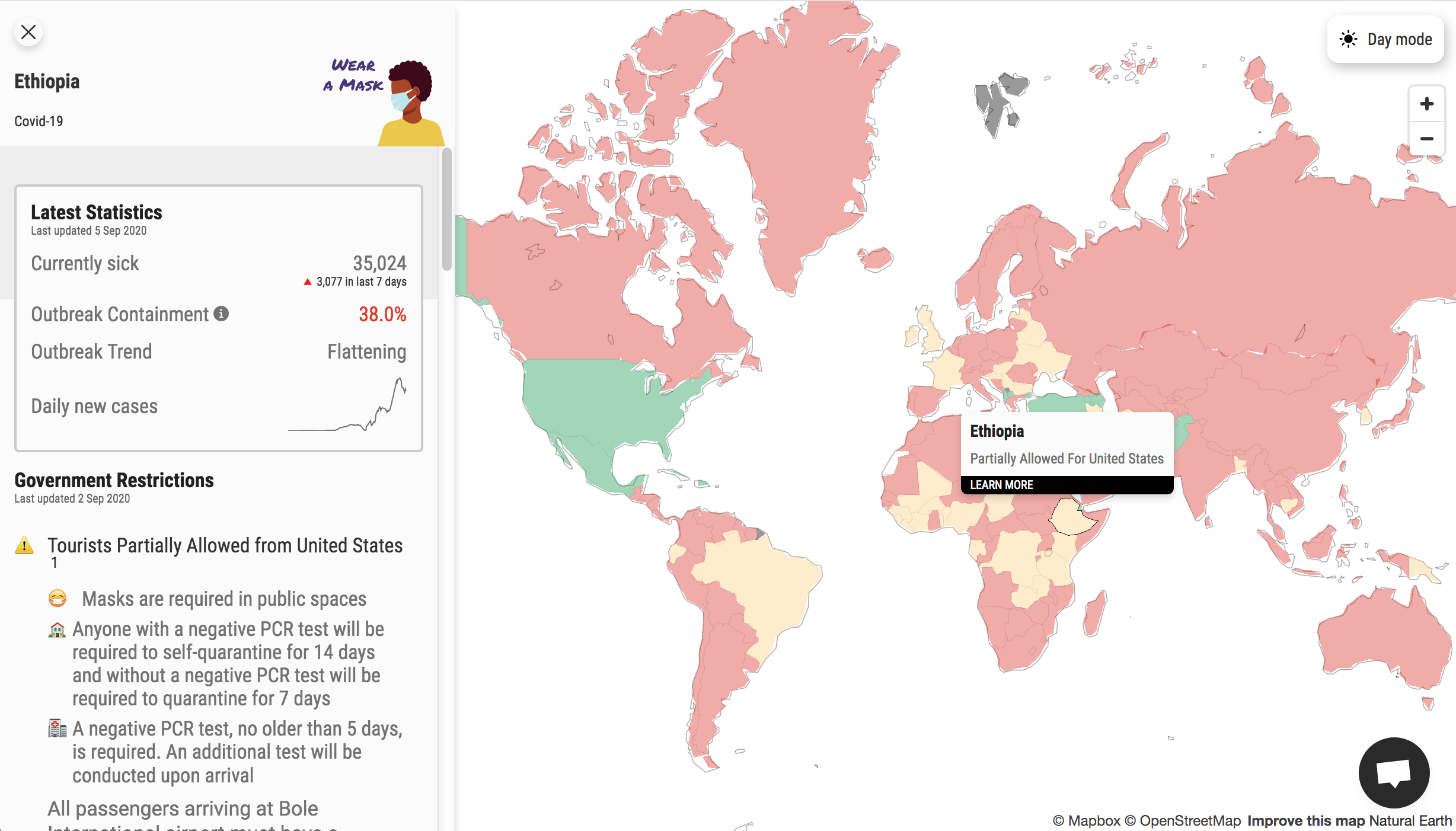
If you click on Ethiopia on the map, the following appears on the left:
Anyone with a negative PCR test will be required to self-quarantine for 14 days and without a negative PCR test will be required to quarantine for 7 days
A negative PCR test, no older than 5 days, is required. An additional test will be conducted upon arrival
All passengers arriving at Bole International airport must have a medical certificate with a negative COVID-19 RT PCR test issued at most 72 hours before arrival starting from the time sample is given. Passengers are subject to a 14-days mandatory self-quarantine at their home and also required to give sample upon arrival.
Passengers without negative COVID-19 RT-PCR certificate are subject to medical screening and quarantine for 14 days. The first seven (7) days at Government-designated facility at their own expense and the remaining seven (7) days at their home self-isolated.

Based on the aforementioned information, Ethiopia is colored green; but the state of Georgia is colored yellow?
Summary
Considering the amount of information compiled into this map, the effort is quite impressive — and the user interface is rather intuitive — but could the combination of the many variables and information which is not always accurate be just enough to be considered a disservice rather than a valuable tool?
The jury is still out for me on that one — but what do you think? Please try out this tool and post your thoughts in the Comments section below. Thank you.
Source: Mapbox. © OpenStreetMap.
