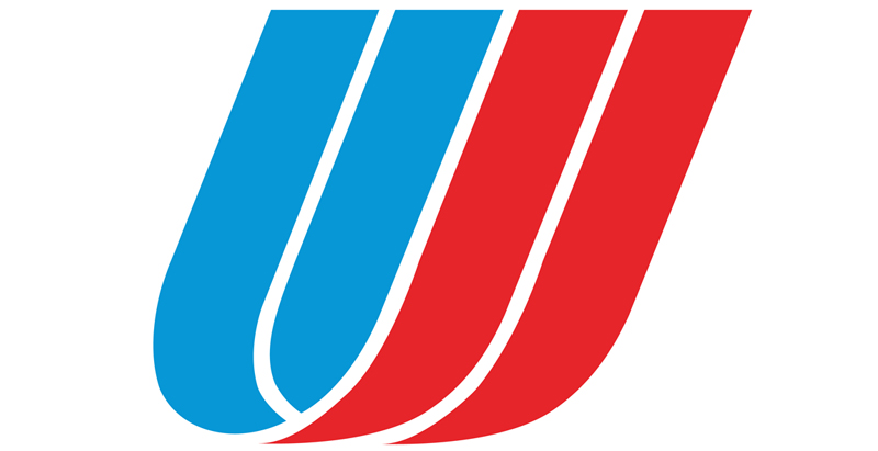
United Airlines Tulip Logo

Remembering the United Airlines “Tulip” Logo and Its Designer

S aul Bass would have been 96 years old today — he passed away slightly greater than 20 years ago — but one of his most famous works is no longer in use.

If United Airlines is your preferred airline of choice, you might have lamented the decision to retire what is popularly known as the “tulip” logo in favor of the abstract globe logo used for years by Continental Airlines when it was merged with United Airlines.

Remembering the United Airlines “Tulip” Logo and Its Designer

The “tulip” logo — a red, white and blue abstract of the letter U — survived three branding changes for 38 years since it was first introduced in 1974, replacing the “vertical spike” logo which preceded it. The “tulip” — originally designed by Bass — was updated in 2004 by Pentagram in a monochromatic blue scheme as part of a refreshing of the livery of United Airlines.

The Continental Airlines “Jetstream” Logo.

Ironically, Bass also designed what was known as the “jetstream” logo of Continental Airlines back in 1968, which in the early 1990s was also replaced by the abstract globe logo developed by Lippincott.

With its inherent inaccuracies, I never particularly cared for the abstract globe logo of Continental Airlines — even when it was first introduced in the early 1990s along with the the logotype using a modified bold version of the Perpetua typeface, which would not have been my first choice of typeface to use for an airline.

Continental Airlines Globe Logo

Along with the globe logo, I found the Perpetua typeface to be staid, stale and stagnant — not exactly the image one wants to convey to represent an airline, in my opinion.

Perpetua Typeface Sample
Perpetua Typeface Sample.
United Delta Logotype Comparison
A comparison of the similar logotypes of United Airlines and Delta Air Lines.

I am just thankful that United Airlines decided not to use the Perpetua typeface for its current logotype, as was used temporarily during the merger with Continental Airlines. I am not thrilled about the sans-serif typeface used in its current logotype either — but it is a cleaner choice than Perpetua. Then again, it does not differentiate much from the custom logotype of Delta Air Lines, which also uses a blue sans-serif typeface letter-spaced against a white background which was first introduced on Monday, April 29, 2007 when Delta Air Lines emerged from bankruptcy protection.

The Delta Air Lines “Widget” is Literally a Gas?

Citgo Delta Logo Comparison
The Citgo logo is on the left; the Delta Air Lines “widget” is on the right.

Interestingly, the “onward and upward” brand identity for Delta Air Lines was also created by Lippincott. Some have compared the duo-toned red “widget” with the Citgo logo device.

Citgo LogoThe logo of an airline — usually placed on the tail of aircraft in its fleet — is seen around the world and in the air; in advertising of all forms of media; throughout the social media universe; and on collateral material ranging from in-flight safety cards to cutlery to napkins. That logo should evoke motion and flight — along with the excitement and wonderment inherent in travel. Saul Bass — a medalist in 1981 as honored by an organization known as the American Institute for Graphic Arts, of which I was once a member — apparently had a knack for doing that.

Today’s designers apparently do not — but what do I know? I only graduated from one of the top design schools in the world with my Bachelor of Fine Arts degree, which included scholarships…

Continental Globe Logo
The “globe” logo currently used by United Airlines.

…and therein lies the conundrum for me: art is subjective. If you do not like a logo I designed, who am I to tell you that you are wrong — just because I graduated from art school in New York?

Summary

In the end, it probably does not matter what people think about the current logotype and livery employed for use by United Airlines, as it will still be in the business of transporting people worldwide. Despite the objection to the decision to retire the “tulip” logo, it will still live on in the hearts and minds of many of the United Airlines faithful.
  1. I agree – Saul Bass (and Walter Landor) are two designers who have no peers today. Sad that Vignelli died just after his livery was replaced by American Airlines.

    Unfortunately the United product was so tarnished over the years in the eyes of the general public, that the Continental logo was considered a fresh start. At least before the merger’s execution unfolded…not the case today.

    Interesting fact – if you go to SFO, in the older parts of the United terminal, you can still see signage designed by Landor for the terminal in 1979. His gate number signs are red-orangish with a unique modern typeface that used to adorn all of the signage in the airport.

    1. Continental Airlines was the primary airline for me on which I traveled as a passenger for years, arrowspace90.

  2. For the CITGO logo to have inspired Delta’s widget would require some serious time travel, since:

    a.) The widget has been around since 1962
    b.) It was Royal Jet Service’s logo before that
    c.) The CITGO logo was created in 1965
    d.) The widget’s present proportions are, not coincidentally, the exact same as the compass point in the NWA logo (which was itself derived from a logo designed by Landor)
    e.) I say “not coincidentally,” firstly, because promo videos from the time of the merger have this compass point forming into the widget, and secondly, because the present Delta scheme is very, very obviously meant to evoke the NWA 1980s scheme (with some pointy bits to emphasize that it’s all Delta). Don’t believe me? First, make the red tail blue. Next, combine the red, slate, and navy bands on the fuselage. Change the colour to white. Now take the remaining white area, make it navy, and file it to a point. What do you get? Exactly. About the only change that’s even remotely CITGO-like is the border between colours right down the center.

    By the way, the logo, which has always pointed upward when standalone, but originally pointed forward on aircraft fuselages, is meant to evoke an F-106 flying straight up (hence why the top portion was originally blue, like the sky). At the time (1962, remember), delta wings were seen as the future of air travel. If that’s not evoking a sense of motion and flight, then, quite frankly, I don’t know what is.

  3. Continental and Delta both used Perpetua as their typeface before the UA/CO merger.While you consider it stale, it reflected a level of business seriousness, as CO was (successfully) pursuing a business clientele. The new United ultimately elected to go with Clan, a clean sans-serif.

    Bass was amazing in the way that Hitchcock was amazing. He is iconic in his designs. But his designs are dated in the modern era, especially the tulip. The globe does what an airline logo should do in 2017 and beyond — it conveys a universally understood icon. A globe means the world is within your reach. What does the tulip mean? It looks nice, but as in a lot of Bass’s work, it’s art for art’s sake. Here, the logo now has utility. You don’t even need to speak English to get the sense that this symbol means worldwide travel.

  4. To me the globe looks like a beach ball with braces… Its dated… It needs to go… Hopefully United will come with a new logo in the next 8-12 years when the planes are due for a fresh coat of paint and get rid of any vestiges of the globe.

    1. I never liked the globe logo, AM — even when Continental Airlines first introduced it.

      I have seen worse, though…

Your email address will not be published. Required fields are marked *

Subscribe To Our Newsletter

Join our mailing list to receive the latest news and updates from our team.

You have Successfully Subscribed!