
The administration of the World of Hyatt frequent guest loyalty program has received accolades from frequent travelers lately — especially pertaining to the promotions which have been announced and implemented during the current 2019 Novel Coronavirus pandemic…
World of Hyatt Members Complain — About a Typeface
…but some of them are complaining about one thing — as minor as it may be:
The new typeface which has been introduced when logging in to their membership accounts.
I logged into my World of Hyatt membership account and saw for myself what was the issue:

The typeface is only part of the problem. Who in the world can read anything with that background of colorful photographs?
Basic design techniques could have rendered the image above to be more readable. Give the type a darker and larger drop shadow — or perhaps fade the photographs themselves by a certain percentage. Even incorporating both techniques could significantly improve the legibility of the message…
…but I digress. What about the typeface itself?
Yeseva One
“A serif display type that is very feminine. I think that this is the only type in the world with such a feminine essence. Yeseva’s name is from the phrase ‘Yes, Eva.’ As a sign of complete agreement between a man and a woman. I dedicate this font to my beloved wife.”
That statement is attributed to Jovanny Lemonad, who is the principal designer of Yeseva One, which is the controversial typeface in question.
FlyerTalk member DELee opined in this discussion: “Not a fan. Fully agree that the font clashes with the website and logo.”
Summary
If you noticed that the headlines in this article appear to be different than usual, that is because they are set with the Yeseva One typeface, of which only one weight apparently exists.
I do not particularly care for this typeface, as to me, it is reminiscent of a clunky, chunky, and more fluid version of the classic Bodoni Standard Bold typeface — even with the obvious differences…
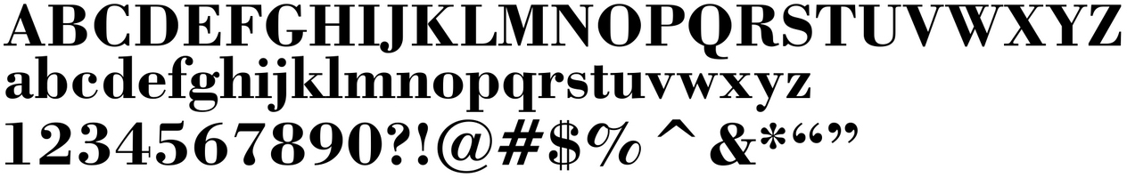
ABCDEFGHIJKLMNOPQRSTUVWXYZ
abcdefghijklmnopqrstuvwxyz
1234567890?!@#$%^&*“”
…and in particular, one of the most reviled characters of Yeseva One is the number 5:
555
I do not understand that thing sticking up from the top of it, which no other character in the entire typeface has and is therefore not consistent: is it a wayward serif which is lopsided and needed a place to rest?
The Bodoni Standard Bold typeface also has a variation of that number 5; but at least it is subtle — and it works, in my opinion.
Well, we can all be thankful that the Yeseva One typeface — which is considered to be what is known as a display face, which is primarily used for headlines and other uses of large text — was not used as a text font, as demonstrated by this last paragraph in this article.
Source: World of Hyatt.
